|
|
Post by Conkwe on Sept 13, 2017 20:17:19 GMT -8
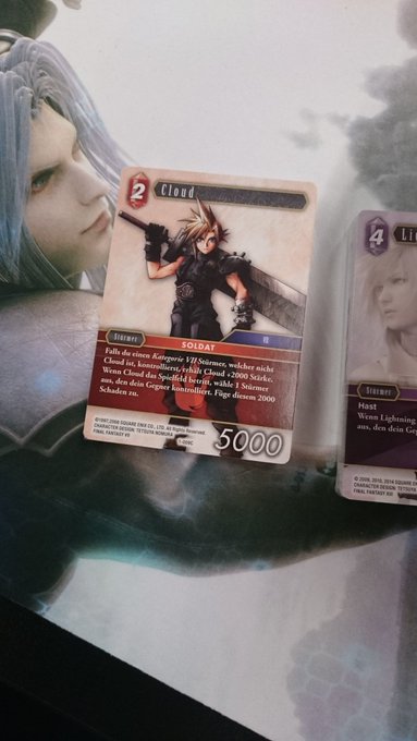
Does anyone know the reasons behind the new card template change? The only thing I can think of is the most obvious: to have more category space. This makes me wonder if there'll be cards with more than two categories. If anyone hasn't seen them yet, here's the old card design:  New card design:  |
|
|
|
Post by Conkwe on Sept 18, 2017 14:27:50 GMT -8
Okay, the new card spoilers pretty much just answered my question. They needed more space for the categories, specifically for the Theatrhtym cards. I should have known. We've known for a while that Opus IV confirmed monster cards for this expansion. There are a lot of monster cards in the older Chapters version. A lot of them are Theatrhtym cards. |
|
|
|
Post by tangentthought on Sept 19, 2017 9:07:27 GMT -8
I'm surprised they didn't plan for this at the beginning. Should've used a music note icon or something.
|
|
|
|
Post by Conkwe on Sept 19, 2017 11:06:15 GMT -8
tangentthought Yeah, I guess they didn't think about it. They didn't have categories back in the Chapter series. Makes sense to do the change now though. I don't think an icon would cut it if people didn't know what Theatrhythm was. It probably would've confused more people with a symbol instead of the game abbreviation.
|
|